Shopping Cart
Your cart is empty.
Search Products
Shopping Cart
Your cart is empty.
Search Products
The colour of your picture frame does more than just surround your artwork. It shapes how it's seen and felt. Whether you're decorating a home, office, or gallery wall, the right frame colour can highlight details, balance tones, and blend clearly with your space.
A bold black or navy blue frame can create a sharp contrast and focus. It makes it ideal for modern prints or monochrome photos. Lighter tones like oak, white, or pastel pink give a softer, more natural finish that works well in minimal or Scandinavian interiors. Metallic colours like gold or silver add a touch of elegance to certificates, mirrors, or classic paintings.
Choosing the right colour helps your image stand out without clashing with walls, furniture, or surrounding frames. It's not just about matching, it's about completing the picture.
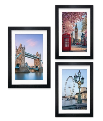
With over 20 colour options available at Alison Kingsgate, there's a perfect frame for every photo, print, or poster. Here's how some of our most popular frame colours work in real spaces:
You can browse all available colours on this page to find the one that fits your space and style. Whether you're going bold or keeping it simple, we have everything for you.

Fast Shipping
Direct From UK Factory
Support 24/7
Contact us 24 hours a day
100% Money Back
You have 30 days to Return
Payment Secure
We ensure secure payment